Global Navigation Redesign

+30% conversions | –15% friction score | –28% bounce rate

Role :
Lead UX Designer, Researcher
Company :
Splunk
Tools :
Figma, Miro, Usertesting, Mouseflow, Google Analytics
Design Process
The design process included multiple overlapping stages that were often developed in parallel rather than following a strict linear path
Research /
Analysis
Step 01
-
User Research
-
User persona
-
Competitive Analysis
-
Information Architecture
-
Usability testing
-
Stakeholder Interviews
Ideation /
Testing
Step 02
-
Low fidelity wireframes
-
Usability Testing
-
Iterations of Edits
Design
Step 03
-
Interactive prototyping
-
User Testing
-
Icon Design
User Persona
Based on user research we defined 3 types of our users with all three following into two categories: a prospect or an customer existing customer,
Prospects
Customers
The CXO
Need: clear, concise information that shows ROI, cost savings, and business impact, along with trust signals, scalability, and easy-to-digest content like videos or demos.
Pain point: is the lack of clear, business-focused information that highlights the product’s value, scalability, and security without delving into complex technical details.
Behavior: CXOs tend to favor short video summaries, trust signals and prefer concise content.
The CXO
Need: CXOs need quick, high-level summaries that show product alignment with company goals, seamless integrations for smooth workflows, and assurance of continuous improvement with access to new features and emerging technologies.
Pain point: is the lack of clear, business-focused information that highlights the product’s value, scalability, and security without delving into complex technical details.
Behavior: CXOs tend to favor short video summaries, trust signals and prefer concise content.
The Tech Exec
Need: Need easy access to resources, interactive demos, data-driven insights, and rely on team feedback for decision-making.
Pain point: Frustrated by vague messaging, sales pressure, and complex deployment or integration challenges.
Behavior: They are going to opt for a rep-free experience, engaging with demos and documentation independently, and compare solutions based on features, ease of use, and integration, valuing transparency in pricing.
The Tech Exec
Need: They want direct access to provide feedback and influence the product roadmap, need timely updates on new features, and require ongoing training and resources to keep their team effective and up-to-date.
Pain point: They may feel frustrated by misaligned updates, slow support, outdated documentation, and performance issues like lag or bugs.
Behavior: They monitor updates, optimize usage, and gather feedback to improve the product's impact on their team.
The Practitioner
Need: They need free trials, clear integration details, and comprehensive documentation to evaluate the product independently.
Pain point: Practitioners pain points include limited evaluation access, unclear integration details, and disruptions from sales interactions.
Behavior: Practitioners prefer hands-on evaluation, avoiding sales interactions, and focus on testing features, functionality, and integration.
The Practitioner
Need: Practitioners need regular updates, seamless integration, and proactive support to address issues before they escalate.
Pain point: Practitioners are frustrated by slow support and maintenance challenges, such as updates disrupting workflows or breaking integrations.
Behavior: Practitioners explore new features, optimize daily workflows, and prefer self-serve troubleshooting through docs and forums before contacting support.
Problems
I conducted a usability test on our existing navigation to understand what is working and what is not amongst our users. I also Interviewed stakeholders along with looking heatmaps and analytics to identify any problems with the current navigation
High friction scores and bounce rate signaled frustration
Lacks visual hierarchy
CTAs are misleading and not descriptive of where it takes the user
Certain parts of the design causes users to overlook them
Not using industry terms that prospects are used to making things hard to find
Nav led with Security first from a strategy stand point which confused users when Platform was required
Visually unappealing and lacks brand identity
Redundant links

"It looks simple, but then when I open up products it's quite a lot Maybe some of these subcategories can be consolidated so it's a little less of an eye chart when I open it up and just frankly fewer items to read."
Research and Insights
Overview of the different types of research conducted to gather and identify all issues and prioritize them
Stakeholder Interviews & Workshops
Partnered with Product Marketing Managers and other business leaders to understand messaging business priorities to prioritize the needs of the global navigation redesign
Competitive Analysis
Conducted a competitive analysis to understand how other industry leaders displayed their global navigation with a focus on :
-
Messaging
-
Visuals
-
Information Architecture
Some of the key things that were noted is that they used common industry terms that resonated with users. The had engaging visuals along with conversion oppourtunties
Card Sorting Test
Conducted a card sorting test to understand users mental modals on where they expect to find certain links

Design iterations
First Approach
Introduced a multi-drawer flyout
Broke out all product types into their own flyout
Introduced promoted assets within our
global navigation which can be used to promote free trials, e-book, events etc.
Within the flyout each drawer focuses on a different aspect of that product category


Low & Mid Fidelity wireframes
Low fidelity wireframes went through 4 rounds of testing and design feedback along with feedback from stakeholders and business leaders.


Feedback after user testing
Overwhelming
Takes to long to find what user is looking for because of the drawer model
A lot of white space in some areas
Eye catching visuals for product tours and demos
Links were placed where used expected them to be
Users like that the products we broken out by category : Secuirty , Observalibility and platform
Hard to scan
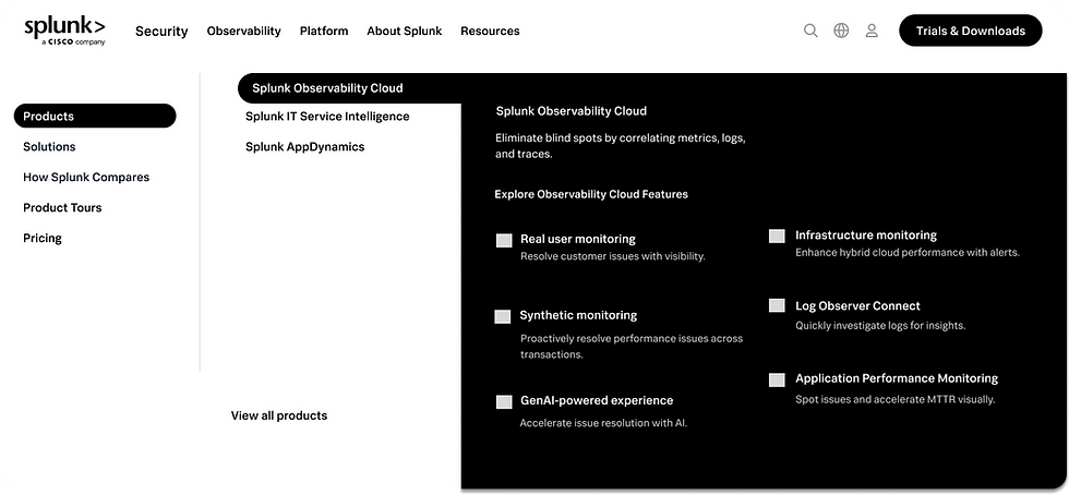
Refined Solution
Transitioned from one consolidated product flyout to individual nav items for each product category. This change allows us to tailor supporting content and resources to each category, providing more clarity and targeted value to users exploring our offerings.
.png)
Transitioned from one consolidated product flyout to individual nav items for each product category. This change allows us to tailor supporting content and resources to each category, providing more clarity and targeted value to users exploring our offerings.
The global navigation will now lead with Platform, reflecting its role as the foundation of our core products.
Since Platform is essential for enabling both Security and Observability products, this structure is designed to help users better understand how our products work together as an integrated ecosystem.
.png)
.png)
Strategic Promotional Content
Added a section to showcase assets demonstrating ROI on our products, industry-specific benefits, and awards our solutions have won. This aligns with the needs of our "CXO" persona, who actively looks for proof points and validation when evaluating new technology investments.
.png)
Introducing Industries
Industry fly out is designed for users who may be unsure which product fits their needs, allowing them to explore solutions based on industry context. This supports both CXOs and technical executives by helping them quickly identify the products and capabilities most relevant to their sector.
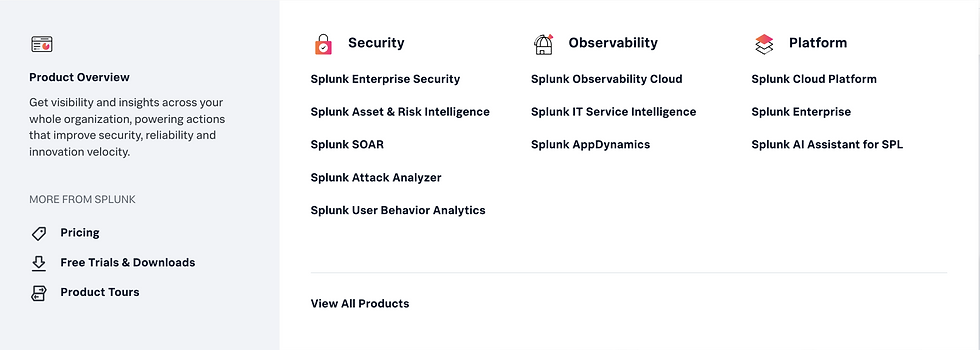
Adding Descriptions
Added concise explanations under each link to give users more clarity about what the destination page contains and what value they can expect, reducing uncertainty and improving navigation confidence.
Highlighting events
a calendar icon with a notification badge that highlights all upcoming events when users arrive on the site. Our company invests heavily in events, which generate significant conversions. These events support all of our personas by giving them opportunities to learn about products, explore new features, and interact with other customers.
.png)
Giving Ai a Spotlight
Designed a spotlight section for AI to ensure users can quickly access AI-related content, addressing a major topic of interest for decision-makers
.png)
Impact
We were able to implement IA changes to the existing navigation before launching with the redesigned navigation and saw positive changes
30%
Increase in conversions from nav clicks
28%
decrease in bounce rate from nav source traffic
15%
decrease in friction score
Before


Final Prototype

